Picture the Light in Your Life!

Sunday, August 15, 2010

Heartfelt Flowers

When I was at the Creating Keepsakes Convention in July, I did a lot of window shopping and some SHOPPING shopping! One of my finds was a stamp set from Heartfelt Creations. They have several stamp sets that coordinate perfectly with Spellbinders. Here's a card I made using my new toys!

The card answers a few challenges:

Papertake Weekly: Something Old, Something New (old paper, new stamps!)

Allsorts: Paper piecing

Mark's Finest Papers: Think Flowers

Pile It On: Get into Shape. ***********BONUS********* Check out their blog for details on how to win a Limited Edition Workbox. It's a fantastic prize that can help you organize your crafting AND looks like premium furniture! There are several beautiful finishes and comes from the folks at The Original Scrapbox. You can also enter at this blog: Rachelle's Writing Spot. Now for details on the card! I used the largest and smallest stamps in the set to create a background paper. I used the smallest stamp to create the border on the base of the card.


I stamped the largest flower on orange paper and on ivory. The smallest flowers were stamped on ivory. Then I fussy cut or die cut them all, applied bling and layered with pop dots. Here's a shot to show some of the dimension.

Thanks for looking and please leave a comment!


Cardstock: The Paper Company

Ink: Colorbox Fluid Chalk dark brown, Whispers butterscotch and orange

Stamps: Heartfelt Creations Sunburst Flowers 2

Dies: Spellbinders Dahlia

Accessories: rhinestones, pop dots

Wednesday, July 21, 2010

Birthday Card for Cliffington

I have a great friend who deserves a great birthday card, and I was inspired by something I saw on the Spellbinders blog. I put this together and tore it apart three times before I was happy with it. You know how carpenters measure twice and cut once? Let's just say I'll try to dry fit a lot and glue just once next time!

I've been working on this on and off for a while, and I'm glad I'm finished! In addition to being a card for a special guy, the card actually answers a few challenges:
Caardvarks: Birthday
Practical Scrappers: Use supplies you've had more than a year. Hmmm... I think only the broze ink is new!

The card is dimensional, with the medallion raised on pop dots. And it's actually part of the inside of the card. Here's the card open:

It's not a typical card , I'm going to write in atypical circles in the border. Here's a closeup of the medallion. The sentiment is from JustRite, and while hard to see here, I sprayed the Fleur de lis die cuts with gold glimmer mist.

Another angle shows some of the dimension. I used a geometric stamp and clear embossing powder to create more texture on the blue cardstock.

I used a lot of Spellbinders dies for this card. It didn't seem like this many when I was cutting things out! These cut the parts for the front and the window.

I used these dies for the inside.

Here's a look at stamp I used and the image it makes. Blurry, yes! It's not just the picture. I blurred the image when I stamped it, which is why I stamped it again for my project. But I really like the design to create background papers. This stamp is great on gold paper for elegant holiday projects.
Thanks for looking, and I'd appreciate a comment!
Supplies:
Cardstock: The Paper Company, DCWV
Stamps: Just Rite (Just a Note Set), Autumn Leaves (Block Stamps 2), Holly Berry House
Ink: Versamark, Colorbox bronze pigment, Colorbox French blue chalk ink
Dies: Spellbinders Doodle Parts, Scalloped Octagons large, Octagons large and small, Fleur de lis pendant, classic scalloped circles small
Accessories: clear embossing powder, 1/16" and 1/8" pop dots, gold glimmer mist, copper pearls (Queen & Co.), rhinestones, Zig glue

Thursday, July 1, 2010

I'm alive and blog hop!

I can't believe it's been a month since I posted anything! Work has been busy, but I've found time to have some fun. My dad came to visit, I went to a graduation and then a great graduation party and I've probably driven 2000 miles since the beginning of June! I hope to have something to show later today, but I just finished a great blog hop for Our Daily Bread Designs.

You can get there by
CLICKING HERE!

Wednesday, June 2, 2010

Easy elegance

Don'tcha just love it when a card comes together quickly and looks great?!?
This card is uses the center of the Spellbinders fleur de lis pendant and the Victorian embossing folder from Cuttlebug. Emboss, round corners, stamp sentiment and punch, die cut red metallic and cream cardstock, assemble... and done!
This answers several challenges:

Meljen Designs: silver and gold
Just Us Girls: dry embossing
Cute Card Thursday: no designer paper
Stampin for the Weekend: make someone smile
Crafty Creations: black, white and red
It was hard to photograph the metallic red paper. It is really a fire engine metallic red. I used pop dots to create some dimension.

Here's another closer look. This medallion is created with two white cardstock die cuts and one red metallic.

Supplies:
Cardstock: The Paper Company
Paper: Canford gold
Dies/embossing: Spellbinders fleur de lis, Cuttlebug Victorian embossing folder
Stamp: Studio G
Ink: Stazon black
Accessories: pop dots, corner rounder, 3/4 inch circle punch

Wednesday, May 19, 2010

Pink Birthday

UPDATE: I'm so proud that this card was chosen as one of the Top 5 in the Cupcake Inspiration Challenge at Hope Stamps Eternal. Click here to see the other fabulous creations!

Here's a fun card for my boyfriend's daughter. She went to prom last weekend and she's graduating from high school in June. She's getting ready for college in the fall, but first, she celebrates her 18th birthday in just a few days. She's a girly girl who loves pink and purple, so this is just her style.
To keep the tension, I tied the clips together with narrow ribbon behind the main image, which is colored with watercolor pencils. The colors were blended with damped cotton swabs.

This layered card answers several challenges:

Pile It On: photo inspiration
Secret Crafter: Metal
Stampin Moments: scallops
Hope Stamps Eternal: cupcake inspiration
Spoon Full of Sugar: Cute and girly
Stamp Something: Celebrate something
ABC: U is for Unused Stash (swirly stamp)
KL Stampin and Scrappin: Animals
Stampavie: pink
Gingersnap Creations: pencils
Practical Scrappers: patterned papers

My point of departure for the design comes from 2 Sketches 4 You.

Here's a better look at the layering and the embossing.

I have only recently started using clear embossing powder. Love it! Plus, there are fewer problems with stray specks, which can be an issue when using colored embossing powders.

Supplies:
Cardstock: The Paper Company
Paper: Tinted Medallions, reverse of Drooping Vines (Rose Colored Glasses Collections -GCD), Dennison sketchbook/watercolor paper, gold Canford
Stamp: Hearts Away (Penny Black), So Swirly Stampin’ Around Wheel (SU)
Ink: Stazon black, VersaMark
Accessories: Staedtler watercolor pencils, clear embossing powder (Stampendous), pop dots, curly paper clips, ribbon, rhinestones

Friday, May 14, 2010

Fly!

This is a card for a colleague who is leaving our company. She's taking her life in a whole new direction. Thus, the butterfly and the simple "Fly" sentiment.

The card answers several challenges:
Paper Play: Brown and...
Cricut Cardz: 3 circles
Stampavie: Pink
Totally Gorjuss: pink and green
ABC: U is for unused stash
Sentimental Sundays: For someone special
Cute Card Thursday: someone special
Incy Wincy: Color Challenge
Stamp Something: Celebrate Something
Fab N Funky: metal or metallic
The card design is based on the sketch from Truly Scrumptious:


The butterfly is reverse stenciled. The medallion is lifted on pop dots. Two colors of cardstock are punched and offset behind the sentiment.


This is the first time I've used Mays silk ribbon on a card. It's SO nice to work with! It's not available to me locally, so I ordered it from Sharon Johnson's Stamp Simply Ribbon store online. She has TONS of ribbon in all kinds of colors, but I started with some I knew I'd use: cream, black, and burgundy. I'm sure you'll see more ribboned-up cards soon!

Thanks for stopping by! Please leave a comment and let me know what you think.

Supplies:
Cardstock: The Paper Company
Paper: 3 Birds, Autumn Leaves C’Est Pink
Stamps: JustRite New Times Roman lower case
Ink: Color Box pigment ink in magenta
Accessories: EKSuccess Circle Scissor, Spellbinders Circles, Scalloped Circles and Butterflies, Martha Stewart medallion punch, EK Success ¾ inch circle punch, silk ribbon, pop dots, glue dots

Thursday, May 13, 2010

Embossed and Fussy Cut

I got some new stamps in the last couple of weeks and I got to use them on this card! I picked up the medallion stamp on my way to see my mom for Mother's Day last week. It was stamped with VersaMark, heat embossed with clear embossing powder then fussy cut. The colors are the inks in the unembossed spaces. The backgrounds florals are from a clear stamp set I bought with a gift certificate I won in a blog hop a couple of weeks ago. YAY! I double stamped the images to create extra depth, which is (of course!) hard to see in the picture.


The card answers these challenges:

Card Positioning Systems: Sketch
ABC: U is for Unused Stash
Papertake: Shiny, Sparkly and Special
Pixie Dust: cut it out
Crafty Card Makers: Distressing
Your Next Stamp: cut it out and pop it up
Tuesday Taggers: Do something different (heat embossing for me!)
MelJen's Designs: Flowers and Blooms
The Secret Crafters Saturday Challenge: 3 embellishments, 2 papers, 1 image

The central image is raised on pop dots. Here's the medallion up close:

And another angle:

Thanks for visiting. Please leave a comment and let me know what you think!


Supplies:
Cardstock: Michael's
Paper: Hot Off the Press (Purple Sponged), Basic Grey (Marrakech-Sencha)
Stamps: Starburst Lace (Hero Arts), Kind Deeds (Clear and Simple Stamps)
Ink: VersaMark, Color Box pigment ink (scarlet, orange, violet, cyan), Color Box chalk ink (Warm Violet), Stampin’ Up (Bordering Blue), Tim Holtz distress ink (antique linen)
Accessories: pop dots, corner rounder, ribbon, pearls, clear embossing powder

Thursday, May 6, 2010

Simple Sympathy and More

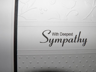
This week, I needed to send a sympathy card to a senior manager in my company. This black and white embossed sympathy card was fairly easy to create, and I put together a few more so I would have them on hand.


I printed the sentiment with my computer and embossed with two Cuttlebug embossing folders. The double embossed lines were made using the Scor-Pal on the reverse side. Why? Because embossing lines with the printed side up will have the raised line on the back of the card. The embossed cardstock is matted on black and adhered to a standard 5-1/2 x 4-1/4 card created from white cardstock.


The card design is inspired by SusieB on the card messageboard at Cricut.com and also answers the White, White Space and Wings challenge at 365 Cards. I have also made these sympathy cards with navy or dark royal blue so it's less stark. White on white is also good too -- like the Thinking of You card below. The pink card is part of a stationery project for a gift.


Mix and match embossing folders and colors to create projects ranging from elegant to whimsical.


Supplies:

Cardstock: The Paper Company (black, white) and Hammermill (pink)

Embossing: Birds & Swirls and Swiss Dots Cuttlebug embossing folders, Perfectly Paisley on the pink card

Accessories: Fonts (Coronation Script, Arial Narrow), Scor-Pal

Wednesday, May 5, 2010

Anniversary Butterfly Card

I would love your comments on today's card! It uses die cuts, reverse stenciling and a combination of a several challenges:

Practical Scrappers: Stickers
365 Cards: The 3 A's (alpha stickers, arc, anniversary)
Pile It On: boyish colors
Paper Play Challenges: Pastels
Creative Cottage: Circles
Cute Card Thursday: Make Your Own
The Shabby Tea Room: Bling
Tellen's Place: butterflies or dragonflies
Flutter by Wednesdays: open but must have fairy, angel or butterfly

The card is based on the sketch at Papertake Weekly:

To create the butterfly, I reverse stenciled. I inked the butterfly Spellbinder then embossed it onto my white cardstock. Then I centered it in the circle Nestability and cut.

I've had these border stickers for years and I think I used them once before. The border is very flexible so I used it along the outside of the die cut circle underneath the embossed butterfly. This golden border is actually tiny butterflies but looks ends up looking like a scroll in the finished product.


Here's one close up view.

Here, it's easy to see the dimension of the embossing and how the reverse stenciling really outlines the butterfly.

Another angle showing layers of the card:

Thanks for looking! Please leave a comment to let me know what you think.

Supplies:
Cardstock: The Paper Company
Paper: DCWV
Stamps: Fiskars Round of Applause (sentiment)
Ink: Color Box Chalk ink in Ice Blue, Stazon black
Dies: Spellbinders Butterflies Shapeabilities, Circle Nestabilities Small, Curved Rectangles Mega Nestabilities, Fancy Tags

Accessories: Queen & Co pearls in Brilliant Blue, golden border stickers, sheer ribbon, pop dots

Tuesday, May 4, 2010

Purple thank you

Here's a closeup of my latest creation.


It's another monochromatic card. I love that Caardvarks Core'Dinations challenge! I've used a 365 Cards sketch as the basis for the design:
I glimmered up some Core'dinations cardstock, masking a couple of parts to create a design with the original color. The card looks less yellow, more gold and more sparkly and subtle in real life.


The card also works for the following challenges:

ABC Challenge: T is for Thanks
365 Cards: Favorite color
Papertake Weekly: Do Something Different (masks)

Here's some detail on the card. After using a Cuttlebug embossing folder, I sanded the raised sentiment to show the lighter purple of the cardstock core.


The original pictures are more true to color, but... After moving to a different light source, I got some pictures that I think make the card look sparkly... or at least gold instead of yellow!


Supplies:

Cardstock: Core'Dinations, The Paper Company
Paper: DCWV
Accessories: embossing folder from Cuttlebug Thanks set, Nestabilities grand lace border and In Spades Borderabilities, EK Success Moroccan Lace punch (inside), Tim Holtz "Regal" mini mask, Gold Glow Smooch Spritz

Thursday, April 29, 2010

Birthday Flower

This birthday card is my take on a clean and simple design. I finally got my Smooch Spritz sprayer unclogged so I used it on the flourish here.

The design is based on a sketch from Card Patterns:

In addition to the Card Patterns sketch, I incorporated several other challenges into this card:
Sentimental Sundays: flowers and sentiment
Caardvarks: monochromatic card
Flourishes: Timeless Tuesday "Bought It, Use It"
Paper Sundaes: 3 patterned papers, 2 cardstocks and 1 single flower
Creative Belli: birthday
Handfull of Stamps: 2 or more patterned papers


The flower is made by using 2 designer papers with BossKut die. I didn't quite cut the details in the petals, so it adds some texture to the flower petals. This is the first time I have used this die for a project. I was excited to get the Tim Holtz Sizzix die on sale... a month ago. So it was nice to use it and not just leave it in the shopping bag!


Supplies:
Cardstock: DCWV
Paper: 3 DP from DCWV
Dies: BossKut Flower Flourish, Sizzix Tom Holtz Elegant Flourishes
Ink: Orange Colorbox pigment ink
Accessories: Button, ribbon, rub on, pop dots, corner rounder Gold Glow Smooch Spritz


Monday, April 26, 2010

Birthday Blues

I'm never blue about my birthday because it means cake and presents. But this CARD features several shades of blue. The card is based on this Flourishes Timeless Tuesdays sketch, which I turned sideways:
The card also incorporates design challenges from some other sites:
Caardvarks: Monochromatic cards
Raise the Bar: Favorite color
Secret Crafter: distressing
A Spoonful of Sugar: birthday

I love blue, teal and purple. I guess you could say my favorite color depends on my mood.
Here are some closer looks.
HINT for bling word stickers: Cover the whole word with clear low tack tape then lift from the sticker backing. Then you can position the word as you like without losing the shape!

The numbers were embossed with a Cuttlebug folder and then sanded. I used Core'Dinations cardstock that has a lighter blue core. I think it's much easier to sand and expose a different color than to ink so much real estate on a card.
I created the medallion by cutting and embossing with Nestabilities circles then decorating the top and bottom with an EK Success border punch. Then I backed the punched area with coordinating cardstock.

Supplies:
Cardstock: DCWV, Core'Dinations, The Paper Company
Dies/Embossing: Spellbinders circles, Cuttlebug Numbers
Accessories: EK Success Scroll & Dots punch, emery boards for distressing, Studio 18 rhinestone word, pop dots